
Mini Blog Post 1
Insights, Observations, and Analysis from Dr. Downing's Rhetoric Classes

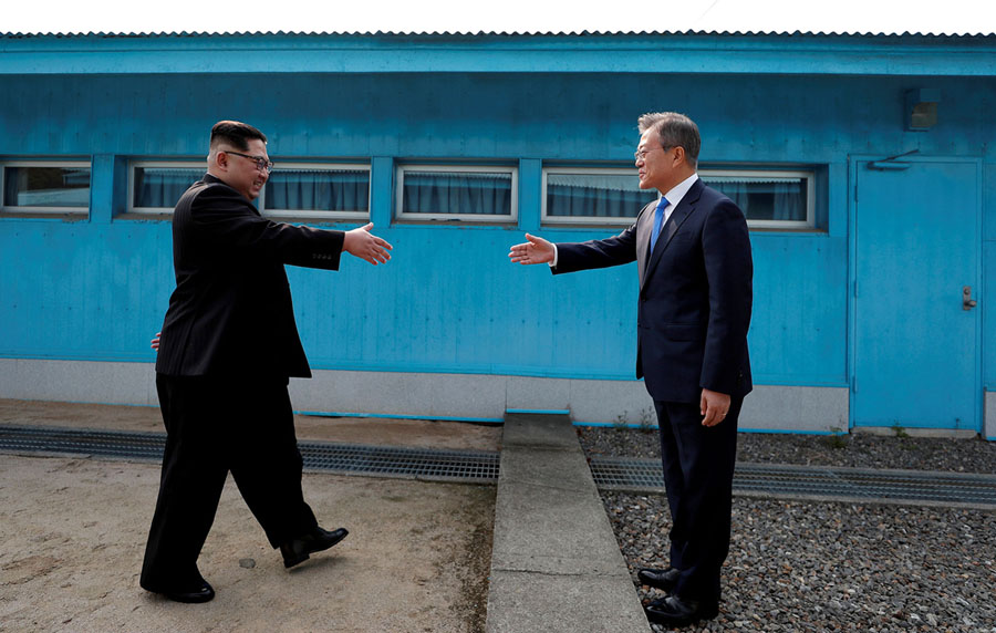 This picture is captivating for many reasons. The first being that these two men, former “enemies” in North and South Korea are coming together to become one. South Korean President Moon Jae-in and North Korean Leader Kim Jong Un meet at the boarder to make a peace treaty between the two nations. The blue hue seen in the background indicates a sense of trust and peace. The saturation is bold and bright giving the scene a lively appearance with high value. The geometrical perspective plays a big role in this picture as we see a cement block directly split the image down the middle. This physical division gives us a visual of the relational division going on, and makes the two coming together even more impactful. There is a medium and average eye level that makes us, the viewer, feel as if they are there watching this exchange occur. The men are wearing dark business wear, indicating that this is a serious matter, and causes them to stand out amidst the bright color and lighting surrounding them. Lastly the smiles on their faces show the genuineness of their truce and their hands in an outstretched motion makes us wait eager exception to what will come next.
 I chose this image of Meghan Markle walking down the aisle to marry Prince Harry simply because when I saw it, it drew me in. At first glance I thought this picture was in black and white, but when I looked closer, I discovered this it is in color. This initial misjudgment is based heavily on what Rose describes about the lighting in a picture. The room in which the ceremony is taking place appears to be fairly dark. However, the windows on the side of the building let just enough natural light in to highlight the blushing bride. This contrast of dark and light helps to add significance to what colors can be picked out in the image, for example, the orange hat. In addition to the source of light being significant for the image (sunlight is typically more flattering than fluorescent), the light also manages to highlight the focal point in this image: the bride herself. This highlight is what is so striking about the image; Meghan Markle practically glows.

The Atlantic recently ran an article on the top 25 photos of 2018
This image in particular caught my eye. This photo was taken in South Carolina shortly after Hurricane Florence. Pictured in this photo, we can see a car parked in front of house being perfectly reflected by the water that submerges a little less than half the vehicle. The technological production is the first thing to be noticed, the resolution is very high making it easy to notice small details like the dirt on the brick wall, the rust on the fence, and the subtle dark mildew growth on the trunk of the car where it meets the water. The colors in this image are typically muted, there is a light gray hue present in the image that is likely due to the overcast setting and the saturation in general is low; however, the blue car has a decently high value which makes it stand out in contrast to the more muted picture. The most interesting part of this image is the reflective part of it. The reflection gives the viewer a unique perspective on the image, being able to see the same image reflected in an almost perfect natural recreation. As mentioned earlier, the day this photo was taken on was likely overcast, because the light present is muted and only serves to give a light gray hue to the image. However, the light also shines directly onto the centerpiece of the image, the car, making it stand out even more than it did. Finally, this image delivers a very mesmerizing feeling, almost like one could look at the picture for hours on end and feel content trying to spot any subtle difference between the reflection and the real thing.


This picture I chose shows the ash that lifted from the Kilauea volcano in Hawaii last year. In terms of composition, this photo has very distinct hues and values. The photo mostly uses hues of grey and green throughout the picture. The green colors in the photo have a very high value, as they are brighter and closer to the “near-white form.” The giant dark grey plume of ash however, has a low value, as the color is closer to black. The use of the hues and values really draw our eye to the dark clouds, making the scene ominous despite the bright green colors of the grass. The photo also uses a lower eye level, forcing you to look up to the giant clouds. This perspective suggests a sense of power, danger and doom.


RHET 4950 Students: If you find an example of interesting visual communication, put a link to it in the comments of this post!
