Analytic Blog Post– April

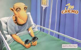
For my analytic blog post, I have chosen to take a look back at culture jamming. In Christine Harold’s article, Pranking Rhetoric: “Culture Jamming” as Media Activism, she makes the point that “culture jamming” is an effective strategy of rhetorical protest. She goes onto to talk about how “pranksters” deploy the tools of the mass media and marketing in order to take advantage of situations and draw new meaning and light to the seriousness of situations. As an example of this, I chose a picture of Joe Camel, the infamous American cartoon used to sell cigarettes during the 1980’s and 1990’s, receiving chemotherapy as a result of smoking. During the 1990’s there was a lawsuit filed against the cigarette company, R. J. Reynolds Tobacco Company, saying that using a cartoon character appealed to children. According to the New York Times, The Federal Trade Commission determined that “the company violated Federal fair trade practice laws by promoting a lethal and addictive product to children and adolescents who could not legally purchase or use it.”

Before this ruling happened however, there was a large wave of artists that brought light to the public health issue in a series of cartoons aimed to show the true impacts of smoking to children. These cartoons are a great example of pranking rhetoric because of the artist’s campaign aims to poke holes in the original narrative and demonstrate an alternative reading to what the original campaign hoped to accomplish. According to Harold, the prankster, uses the culture jamming form to express opposing dominant rhetorics, but then playfully and provocatively makes the narrative fold over on itself. In the Joe Camel ads, Joe Camel seems to live a cool life, riding motorcycles, laying on the beach, playing pool and just generally being “smooth”. By using the same character, similar art techniques and colors the Joe Chemo ad is then almost an answer to the question, ‘what is next for Joe Camel’. Quickly, the message of a suave cartoon camel is turned into an ill and bed ridden one. The reason these images work so well to convey a message is because of the “jamming” part of the culture jamming process. According to Harold, jamming, although it often implies a free-form chaos, requires knowledgeable and disciplined players to work.”

In order for the Joe Chemo ads to work, the audience in which they are intended must also have the same understanding of the issues at hand. If only the Joe Chemo ad was shown to children now, they would not have the background knowledge of who Joe Camel is, therefor it is important that audience be aware of the issues surrounding Camel cigarettes in the 1990’s. Ultimately, the FTC made the right call in banning the use of the Joe Camel cartoon ads, and the artists that produced the culture jamming pieces supported those efforts but playing to the audience’s understanding of current issues and willingness to see the original narrative fold in on itself.

Mini Blog Post 6

For this blog post, I decided to look specifically at the fountain area on campus to dissect the larger meaning of both the physical space as well as the culture of tabling. In these photos you can see that the fountain are is full of tables and tents with people handing out and/or fundraising for different events. To me, the fountain area is meant to be inviting and used as a place for students to gather. The circular shape and the walkway leading up to this area is an important part of the flow between buildings and give passers by the feeling of inclusion. Since 4 large buildings make up the space around the fountain, it can be presumed that most students walk within this space at least once a week, making it an epicenter. Tabling at Georgia College is such a large part of the culture at this school, and when it is done at the fountain area, it makes it feel as if it a welcoming environment. Although some find it overwhelming, it is a nice space on campus that allows different organizations and students to come together. If you do not belong to an organization, it is easy to feel unincluded, but many organizations table to recruit students to be join their club or participate in their activity.

Mini Blog Post 5

For this blog post, I decided to use this picture as an example of pranking rhetoric in the form of “Culture Jamming”. I have seen this type of rhetoric before on social media, but I had never thought it had a name or a deeper meaning. In the article Harold talks about a distinct difference in traditional media pranksters and cultural jammers saying, “media   pranksters,   an   increasingly   active   type   of   consumer   activist,   prefer affirmation  and  appropriation  to  opposition  and  sabotage.  Whereas  the  culture jammer  as  saboteur  opposes  commercialism  through  revelatory  rhetoric  such  as parody, pranksters can be seen as comedians, as playful explorers of the commercial media landscape.” Understanding this difference is key in uncovering the intent behind meaning and cultural relevance of these type of enthymemes. This is an example of pranking rhetoric because it is not directly in opposition of any argument. Instead, it looks at the dominant reading and through reconfiguration redefines the meaning for an audience. In my example, the dominant understanding is that YouTube is a social platform with videos, and in this it is playing on the fact that many people use it to watch cat videos instead of using it as it was intended—a social media platform.

March Analytic Blog Post

For my March analytic blog post, I chose to look at a picture and do a narrative analysis on it. The picture I chose is from 2011, when then President Obama and his national security team monitored the take down of Osama bin Laden.

In Barbastsis’ article “Narrative Theory”, it is noted that as we begin to look at a picture, our attention moves at two different directions at one. This is described as descriptive and logical structure, which is an important concept I want to look at through this photo. The descriptive structure directs our attention outward, and the literal structure directs our attention inward. Looking at this photo in this way, there are so many things happening. In this way, looking at this picture through descriptive structure, the outward understanding we bring to this picture is the understanding of the national relations, the importance of the people in the room and the war leading up to this moment are imperative parts of the narrative. The literal structure makes us look at the literal happens of the picture, the expressions of everyone in the room, the angle of the shot, the tables, the crowdedness of the room.

The descriptive structural reading of this photo could be that several of the most important United States officials are in a room looking at a screen at something happening. The literal structural reading could be that this is a wide shot, with a focus on something outside of the cameras view, with a heavy concentration of people in the right side. These two reading do very little on their own, as Barbatsis notes in the article, and using them together would give a better understanding. For a more combined reading of both I gathered: This picture is a photo of high ranking US officials looking at an important video or picture out of sight, there are only a few most notable officials sitting around a table while others huddle on the right side watching as well, all are in a state of shock and immediately your focus is drawn to Hillary Clinton because of her hand to her mouth in disbelief. Adding the context of the photo, that this was the US Navy SEAL’s live feed of their assassination of Osama bin Laden, the narrative becomes more clear. Although there are more than just the descriptive and literal structures outlined in Barbatsis’ article, I felt that taking the time to look closely at how this structure works and how well it works would be an interesting way to create a narrative.

Visual Narrative

For this narrative story, I decided to use “Portfolio Week” aka a Mass Com major’s worst night mare as my inspiration. All of these pictures deal with the approaching deadline of our final Portfolio, which is how professors determine if we graduate. The first picture is of my final portfolio cover, the second is the files on the Mass Com server which everyone that is turning one in will have to submit their final product, the Coke machine is where most of my (and other Mass Com friends’) money has gone, the next is the library where long hours have been spent, the next is of all my struggling mass com friends in the lab, the lab, and then the final directions to turn everything in. It has been such a stressful week, but if you show any one in the major these photos they will ultimately know and understand the collective feeling of stress and anxiety.

Mini Blog Post #4

An ideograph is a has four major premises within it. 1. It is an ordinary term or idea, 2. Abstraction representing collective commitment, 3. Warrants power/guides behavior, 4. Cultural bound. For my example, this picture plays into all of these. The first level applied for this picture is ordinary words and pictures of former presidents. The words and pictures of these Americans insights <freedom> and the coloring makes that idea even more apparent. The words, “Faith, Hope, Charity” under each picture connect a sense of American dignity. The important cultural bond is that all of these presidents mirror Obama’s ’08 run for Presidential office. The overall meaning of this picture is greatly influenced and takes on a different meaning because of the cultural context, making it a great example of an ideograph.

Analytic Blog Post– February

The importance of the audiences’ understanding of the naturalistic enthymeme is a concept that can be traced back to the series of pictures by Arthur Rothstein during the Great Depression. In the article “The Naturalistic Enthymeme” by Finnegan the naturalistic enthymeme is described as a belief that photographs are inherently true depictions of the experiences around us. The article goes onto to discuss the skull controversy, one of the first times the naturalistic quality that photographs have was called into question. Since that time, the doctoring of pictures has been almost commonplace. From filters, to face correcting apps, to photoshop, it is hard to find a picture that is not doctored before being published to the internet.
For this blog post, I wanted to look at an important cultural moment that also called into question the truthfulness that pictures often have—the depiction of OJ Simpson on the cover of Newsweek and Time. As discussed previously in class, Time magazine’s use of a filter that made OJ appear darker changed the public’s opinions of his crimes.  In this particular case, the consequences could be linked to the publics’ harsh scrutiny of the media and the truthfulness of reporting. In the article by Farrell that we discussed a while back, the use of images and texts made the audience has a better understanding of what the horrible famine in Ireland looked like, and ultimately gave the public a sense of understanding of the of the event because of the media, however, in the case of the OJ Simpson cover photo, the doctoring of the photo turned the public against the media. When the public feels like the media has changed or manipulated a photo, which they perceive to be the truth, it changes the meaning and the willingness of the public to trust the accuracy of what the audience is seeing.
In the article “Don’t Believe What You See In The Papers” by Lewis, it is asserted that people are more likely to believe a photograph based on the similarity of the presentation much like what the human eyes see. The doctoring of photos has become commonplace even in news and magazines, making it harder to understand the difference between what is real and what is exaggerated. In this sense, Lewis’ argument toward both the skull argument as well as the OJ covers would be that because of our experiences with doctored pictures, “we will approach each photograph we look at with the condign skepticism we bring to each story we read”.

As time has given us more technological advances that also has given us more ways to question what is shown to us with little explanation. The doctoring of pictures has changed the way that as a public audience we perceive images to be truthful, reminding us of the naturalistic enthymeme from Finnegan’s article. As we move forward, the solution to the problem is not changing the media, but rather changing the audience’s understanding that most of what we see is now doctored.

Mini Blog Post 3

Image Credit: Alfred Eisenstaedt

Enthymemes are rhetorical devices that allow the user to keep one premise implied or hidden. This type of device is often used to influence the audience and allow them to make connections and inferences based on a cultural understanding. Finnegan in the article, “The Naturalistic Enthymeme”, describes the difference between naturalistic and unnaturalistic enthymemes. An important distinction on what a naturalistic enthymeme is made on page 135 saying, “because we perceive photographs as fundamentally ‘realistic’, we make assumptions about their argumentative potential… we assume photographs to be ‘true’ or ‘real’ until we are given reason to doubt them” (Finnegan, 2001). The picture I chose is the famous picture of the sailor and the nurse kissing on V-J Day in 1945. This picture is a great example of an enthymeme because as a viewer, without context, the couple is believed to be in love or at least emotionally involved, but they were strangers celebrating. The unexplained premise of this photo is that the joy of the advancement of the war toward being over is contagious. Since this photo is older, it is a good example of audiences that would have fallen into the belief that this photo is naturalistic since it was before the era of doctored photos.

Mini Blog Post 2

To me, self-stigmatization is a complex concept, so to help, I added a picture that really allowed me to visualize what self-stigmatization is influenced by.

In the article, Brouwer–The Precarious Politics of Self-Stigmatization, the idea of self-stigmatization is viewed as “the willful marking of oneself as ‘tainted'”. When thinking about this concept, one of my favorite female artists, Frida Kahlo, stuck out to me when thinking about how self-stigma is often expressed. In her painting, Two Frida’s (1939), Frida Kahlo used her art to express her understanding of the social stigma of divorce in her culture, mixed with the way that made her feel. Being a divorced woman, constantly pushing the boundaries of what it meant to be considered beautiful and feminine, Kahlo expressed her feelings of loneliness and sadness. Her art was startling and often set her apart from the social norms showing the world she was “tainted”.

Two Fridas– 1939– Frida Kahlo

Analytic Blog 1

The new Diet Coke campaign “because I can”,  is a great example of an advertisement can be looked at in different ways to get a deeper reading. Upon first glance, this ad is seemingly straight forward: new Diet Coke cans and the phrase “because I can”, however, there are layers lurking under this topical reading that requires unpacking in order to understand what this ad is actually trying to say. The first layer, the dominant reading, is that Diet Coke has come out with new packaging as well as new flavors and the statement “because I can” is a play-off of the display of cans. The new packaging is different and the flavors introduced are key points to this advertisement. Although this ad has very few images and only 3 keywords, there are ways to read into beyond just what is presented on the surface.

Looking deeper, in the Sturken and Cartwright article, they use Barthes’s model to help capture the aberrant reading. In this ad, “because I can” (signifier) + freedom (signified)= Diet Coke gives the consumer new options to choose from (sign). Adding the cultural layer adds another meaning as well. Recently, scientists have claimed that a key ingredient in Diet Coke, aspartame, causes cancer. With that understanding, “because I can” could be seen as a rebuttal to those who might question a consumer’s motives for drinking this soda, even though they know the risks associated with it.

In Parsa’s article Visual Semiotics, he discusses the three levels of understanding a visual or sign: 1. Denotation, 2. Connotation, 3. Mythic. Using this process to read into the Diet Coke ad can be helpful in giving us more of an understanding about what has already been established culturally. In the first layer, denotation, the advertisement clearly shows the change of packaging and a new variety of drinks that the brand now offers. In the second layer, connotation, the “because I can” insights a feeling for the audience of independence and freedom to harness experiences and make choices that they want. In the third layer, mythic, the entire ad is a snub at people who believe drinking Diet Coke will cause cancer. It is almost a response for the consumer to feel justified in if they are questioned by others.

            Coca Cola released a press release with this advertisement saying, “The “Because I Can” campaign, breaking today, is all about doing the things in life that make you happy, no matter what anyone else thinks.” Understanding that this is the company’s intent makes the aberrant reading more relevant. Although they are not saying outright that people should drink Diet Coke and not think about the potential health risks, they are implying a similar message. In this way, understanding the preferred reading is that of happiness and freedom in simple life choices, to subvert that would be to believe the advertisement is empowering consumers to choose Diet Coke even though there is evidence that says that it can cause cancer.